
HiBux™
HiBux is a soft currency implemented on the HiberWorld game platform as part of the advanced reward system initiative. This project involved designing and integrating a soft currency to create a seamless and rewarding user experience with diverse spending options. My role was to develop the concept and design the user interface and experience, ensuring it was intuitive, engaging, and aligned with the HiberWorld brand.
- Digital Design
- Research
- UX
- Art Direction
The Goal
To boost player engagement and satisfaction on a game platform, introducing a soft currency can be a game-changer. Our goal for this project was to implement HiBux™ as part of HiberWorld’s reward system. We aimed to create a seamless, intuitive user experience that encourages players to earn and spend currency, enhancing their interaction with the platform and increasing user retention.
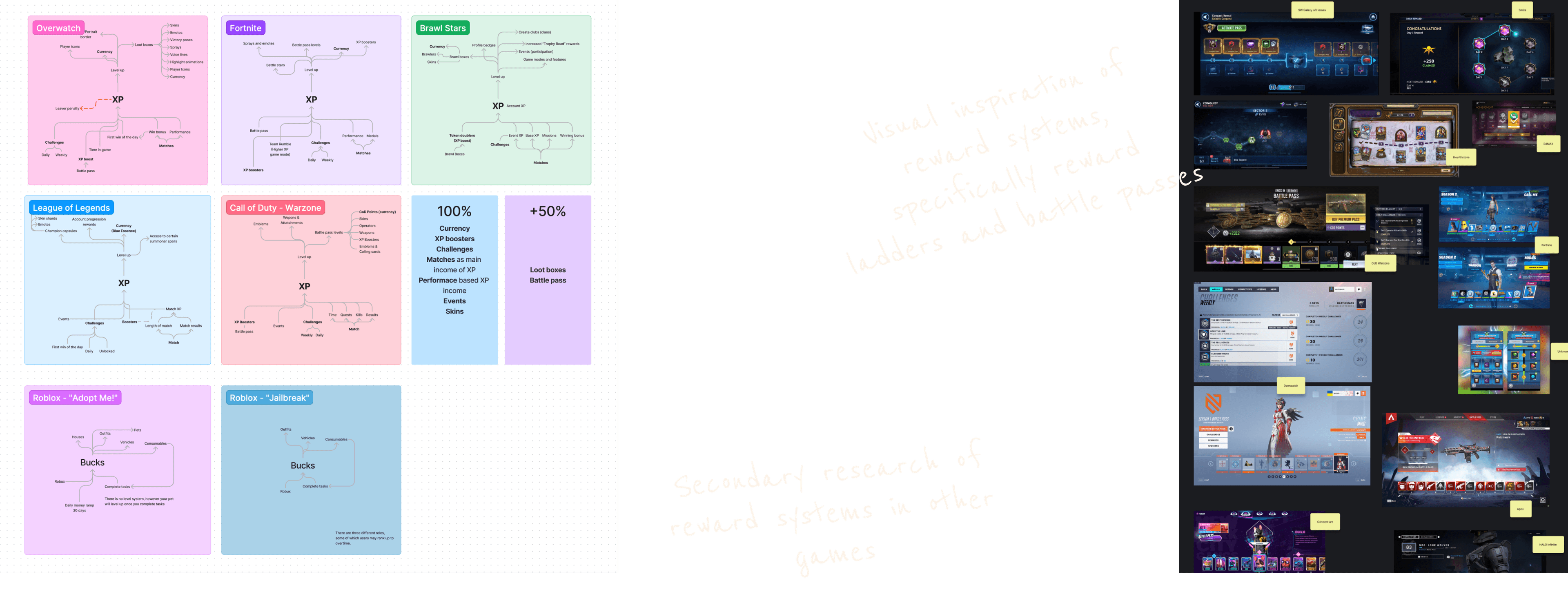
The research phase began with an in-depth exploration of advanced reward systems and the functionality of soft currencies in other games. By analyzing the ecosystems of these games, we gained valuable insights into how soft currencies contribute to an engaging and effective reward system.
Combining this newfound knowledge with our understanding of HiberWorld's user behaviors allowed us to identify the most suitable methods for our users to earn and spend currency. This ensured that the system was not only engaging but also perfectly tailored to our user base.
Research
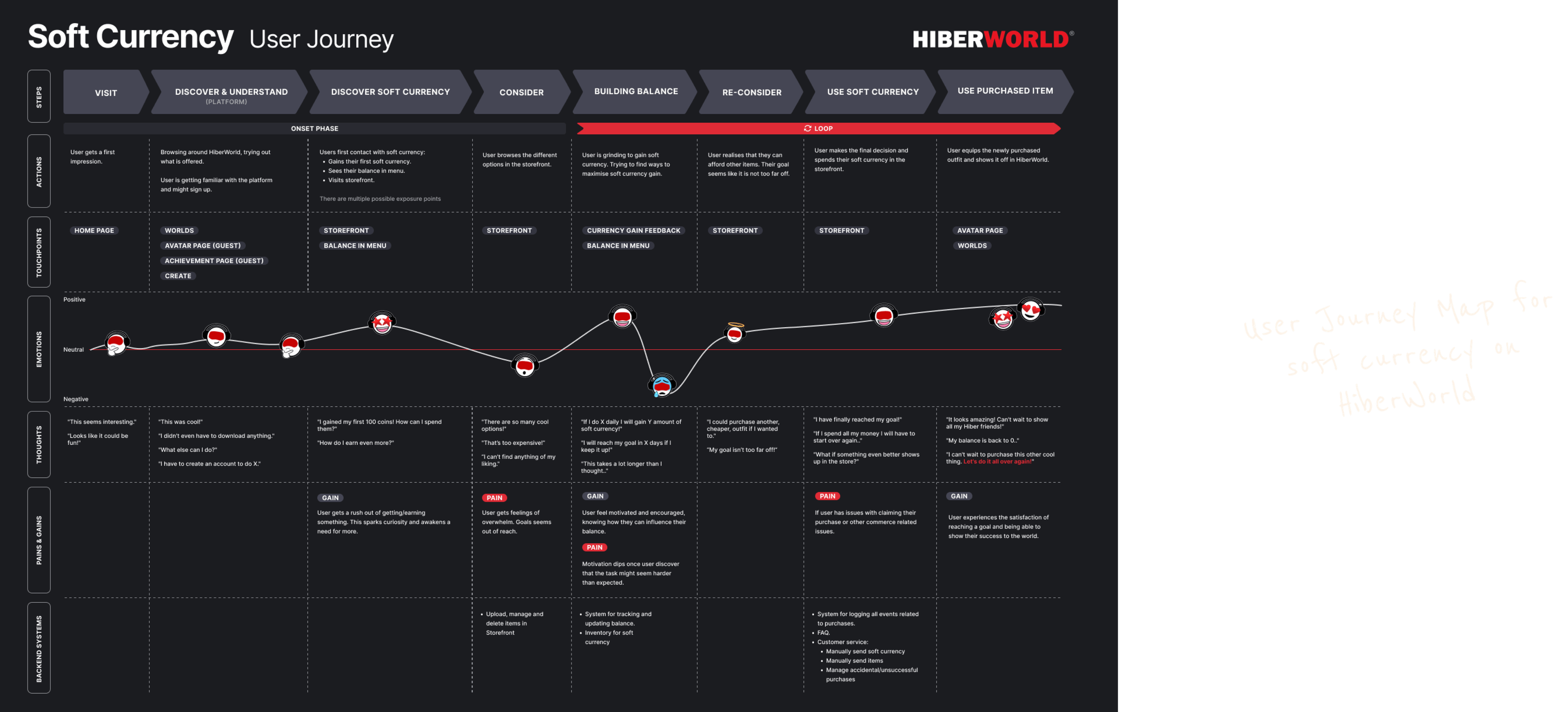
The next phase was to create a desired user journey, following the user from earning to spending their soft currency. Based on our research insights, I developed a detailed user journey map. This artifact highlighted both successful interactions and pain points, providing a clear view of potential challenges and opportunities for improvement. It also played a crucial role in the early stages of understanding the user-facing parts of the ecosystem as a whole. Additionally, we got clear picture of what part of the journey were in the onset phase and what part belonged to the reoccurring phase, also referred to as the loop.
User Journey
With a comprehensive understanding of the entire user journey and the various opportunities for earning and spending currency, we needed to define the MVP scope. This decision was made collaboratively with our Product Owner, incorporating estimates from the development team. After thorough consideration, our Product Owner determined that the MVP would include one method for earning currency, one method for spending it, and a feature to view the user's balance.
Based on our prior research, I proposed that earning soft currency should be tied to completing your daily challenges. For spending, we decided to implement a shop experience where users could purchase new outfits and emotes.
Setting the MVP scope
Earning HiBux
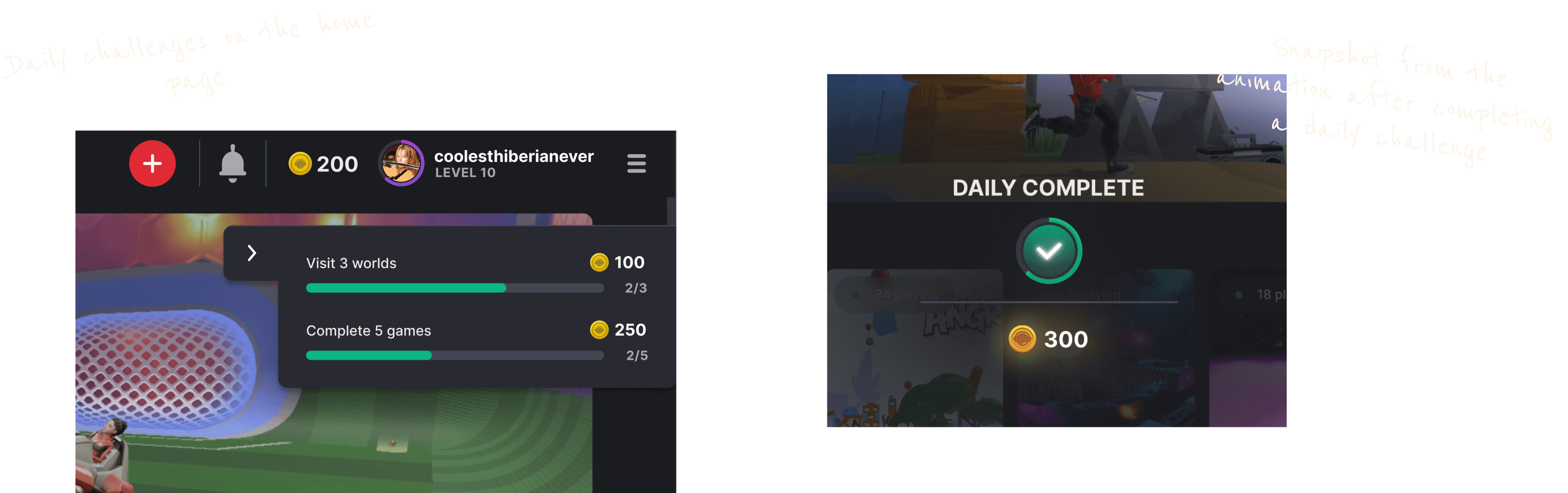
As part of the old level-up system, there was already a daily challenge feature for users to complete. However, this feature had not been revisited or iterated upon since its initial implementation years ago. It made sense to enhance the user experience by providing a clearer user journey and offering a more substantial reward upon completion. This not only revitalized the daily challenge feature but also aligned it with the new HiBux soft currency system.
To improve the user journey, we focused on making the daily challenges more engaging and rewarding. Clearer instructions and progress indicators were added, ensuring that users could easily understand and track their progress. Upon completing a challenge, users would now receive HiBux, offering immediate and tangible rewards that enhanced their overall experience.
Additionally, we designed the reward experience to be more visually appealing and satisfying. When users completed a challenge, they would receive an animated notification celebrating their achievement, along with a breakdown of the HiBux earned. This approach aimed to create a sense of accomplishment and motivate users to engage with the daily challenges consistently.
Daily Challenges
Incentivising user behaviours
This was also a great opportunity to reward certain user behaviours by creating new challenges. For example, we focused on rewarding social interactions such as following, liking, and commenting on other users' games. Additionally, game-related actions such as beating a previous high score or completing a set number of games were incentivised. These new challenges not only promoted positive community interactions but also encouraged users to explore different aspects of the platform, thereby increasing overall engagement.

Showcasing the user's HiBux balance was crucial for fostering engagement and motivation. We designed a clear and prominent display on the main dashboard, allowing users to easily track their earnings. The balance was updated in real-time and accompanied by a visually appealing, animated icon for instant recognition. This feature not only provided users with immediate feedback on their progress but also encouraged them to participate more actively in earning and spending HiBux.
Balance
Shop
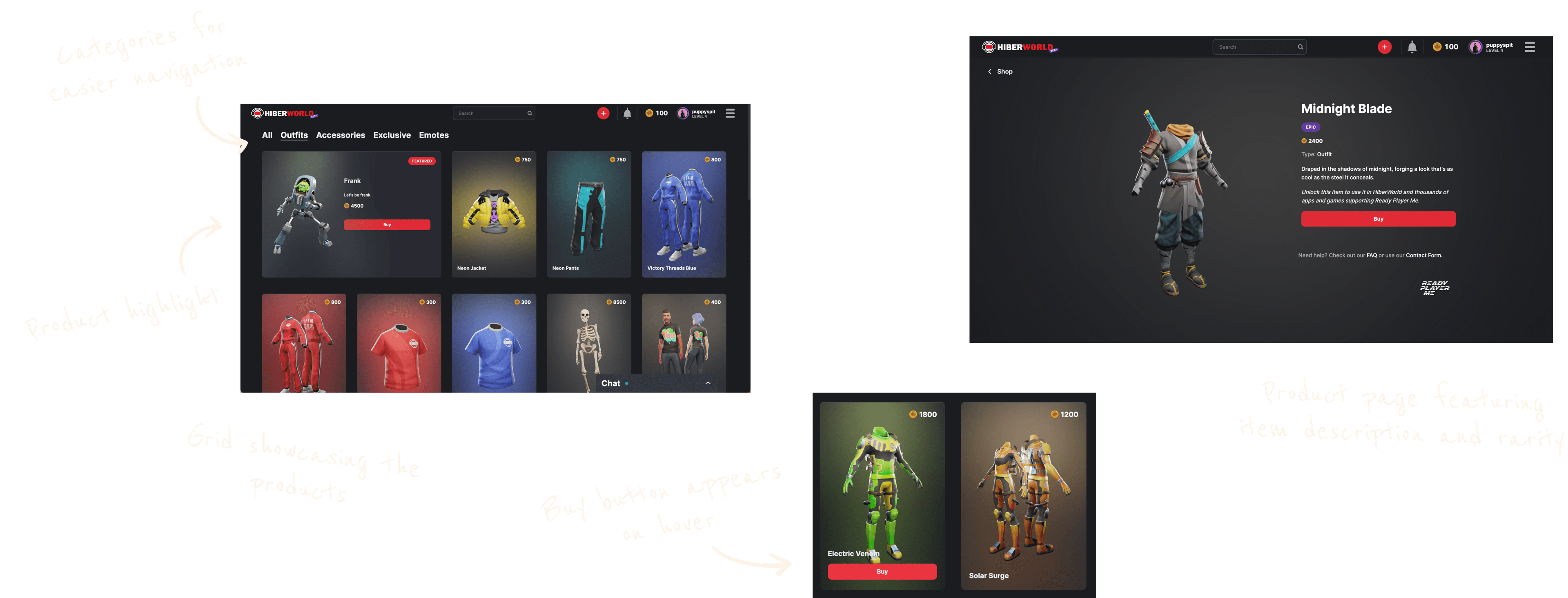
To enable users to spend HiBux, we developed a shop experience as part of our MVP strategy. The shop was designed as a one-page grid with product cards organized into categories for easy navigation. Our plan included gradual navigation enhancements as we expanded the product offerings.
At the top of the grid, we featured a highlighted product spot, showcasing exclusive items available for a limited time to create urgency and excitement among users.
Each product card displayed the price, product name, and an image. On hover, a buy button appeared, allowing users to make purchases directly without navigating to a separate product page.
For the product page, we reused a design from our previous commerce experiences on the platform. Using a previous design optimised development resources while ensuring a consistent user experience across different site sections. This approach allowed us to focus on essential features and functionalities within our project timeline.
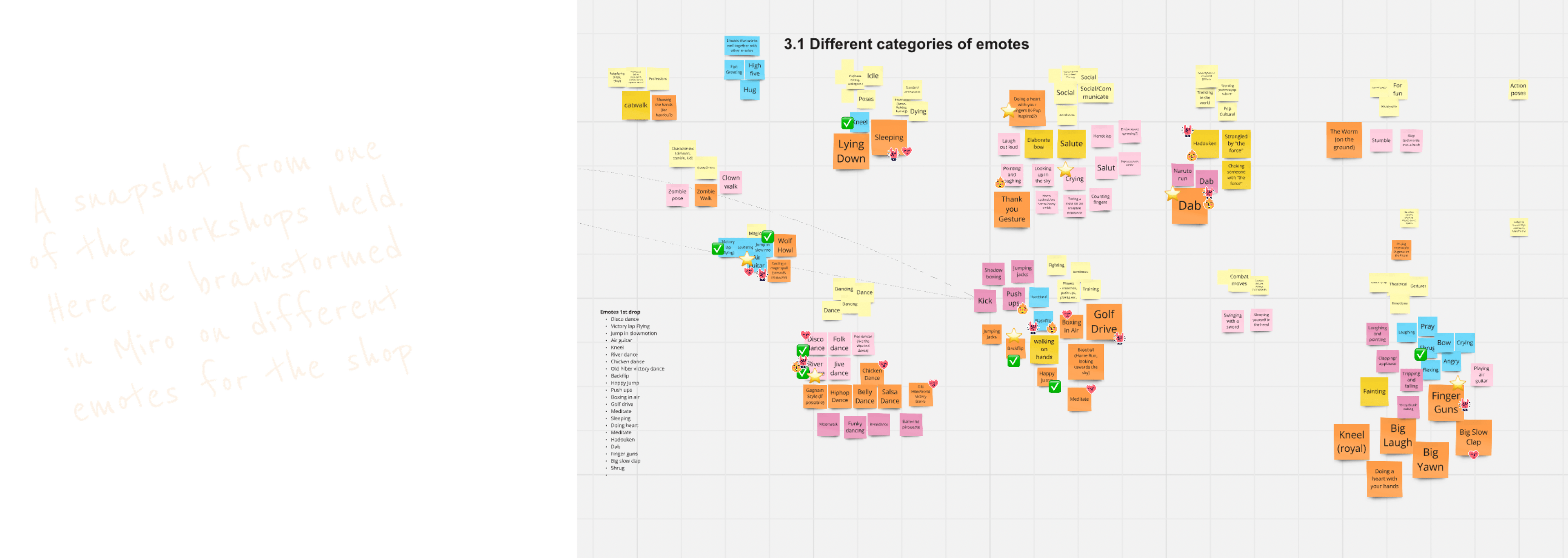
In collaboration with our Art team and Community Manager, I led the effort to populate the shop. This involved conducting multiple workshops to brainstorm concepts and generate ideas for outfits, skins, and emotes. Our decisions were guided by user preferences and available resources. Following these workshops, I worked closely with the Art team, providing feedback on the different designs.
Another fun aspect of my role in this initiative was naming the outfits and writing product descriptions. I collaborated with our Data Scientist and Head of Product to set prices and balance the currency.
Populating the shop
HiBux™
Choosing the name for our soft currency was a collaborative effort led by me, engaging the entire team at Hiber. We started with brainstorming sessions and I set up a spreadsheet for collecting suggestions. Our goal was to find a name that resonated with our platform's identity, was intuitive for the users and had a catchy appeal.
After narrowing down our options, we conducted user testing with our target audience, evaluating four different names. "HiBux" emerged as the clear favorite among both our users and the team. It felt fun, relevant, and effectively communicated the concept of a digital currency, perfectly aligning with the spirit of HiberWorld.
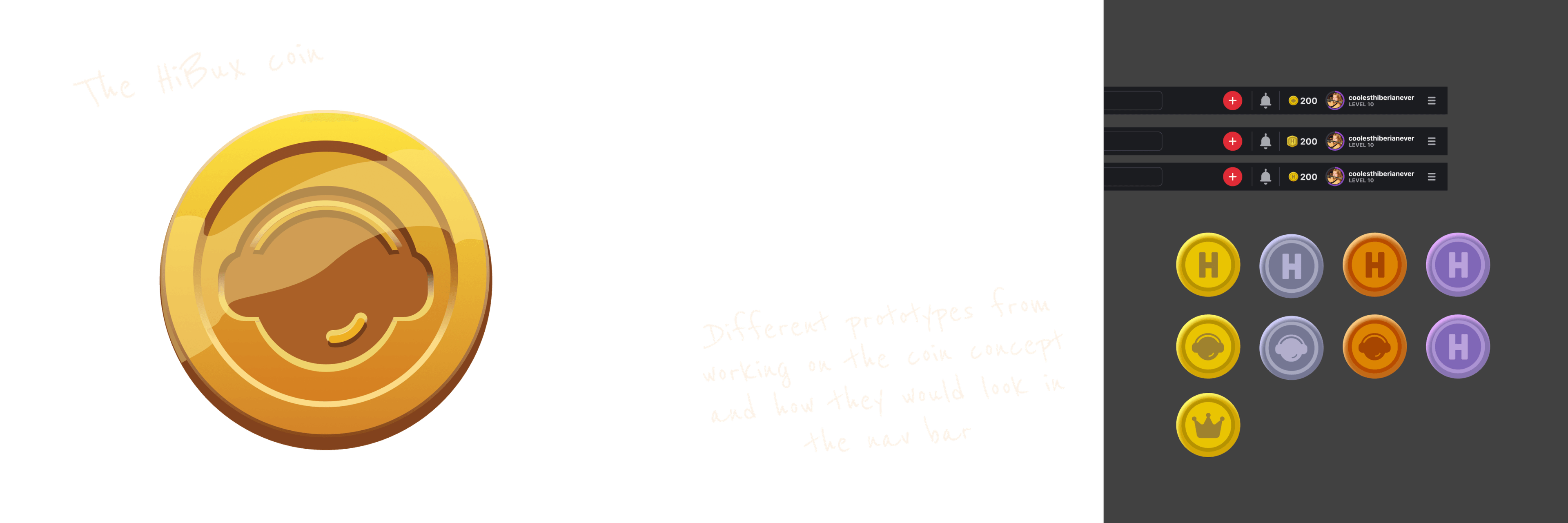
Designing the HiBux icon was a process centred around creating a symbol that effectively represented the digital currency while aligning with HiberWorld's visual identity. We started by exploring various concepts and sketches, aiming to find a balance between simplicity and symbolic representation.
Our goal was to ensure the icon was instantly recognisable and appealing, effectively communicating the concept of value to users.
Ultimately, we chose a classic coin shape adorned with the Hiber logo as a subtle detail, enhancing its premium and timeless appeal. The decision to use a golden colour was deliberate, symbolizing wealth and value, which aligned perfectly with the HiBux concept.
Throughout the design journey, ongoing feedback from stakeholders and collaboration with the Art team were crucial. We iteratively refined the design to meet both aesthetic standards and functional requirements. As a final touch, I incorporated a glint animation using Rive, further enhancing its visual appeal and making the HiBux icon even more eye-catching.
The HiBux™ icon
Evaluation & Iteration
After successfully launching the HiBux MVP, we monitored the user data to understand earning and spending habits and which items were most popular in the shop.
We introduced new daily challenges and adjusted or removed ones that didn't perform as expected. We also observed that users were able to acquire all shop items quickly, prompting us to raise prices on new additions and slightly reduce daily earnings. This adjustment helped achieve a balance over time and we identified an optimal equilibrium.
Continuously tracking user behavior is crucial for sustaining the reward system. By regularly updating the shop with exciting new items, we keep users engaged and motivated, encouraging users to show up and grind for their HiBux.
This project stands out as one of the most significant achievements during my time at Hiber, involving a comprehensive UX process and employing diverse methodologies to reach our goals.
Working within a startup environment has honed my ability to swiftly test and iterate, crucial skills when dealing with Minimum Viable Products (MVPs). As a designer, maintaining a manageable scope can be challenging, especially when you have lots of ideas on how to improve the product. This was definitely one of my biggest challenges during this project. Nevertheless, we successfully released a highly effective MVP within the scope, delivering impressive results.
It was incredibly rewarding to work on this project—pun intended. The positive user feedback and increased engagement with the daily challenges were especially fulfilling. As a designer passionate about enhancing user experiences, these outcomes were truly gratifying and highlighted the impact of thoughtful design decisions.